In this Blog, you will see how to use the CAPM App Service created in the last section and create a SAP® Fiori® Elements App.
Table of Contents:
Start the Series from: SAP® Fiori® Elements with SAP® CAPM App
Go to last the Blog from: Sample SAP® CAPM App Setup
Go to the Course from: Learn SAP® Fiori® Elements from
1. Create Fiori® Element App
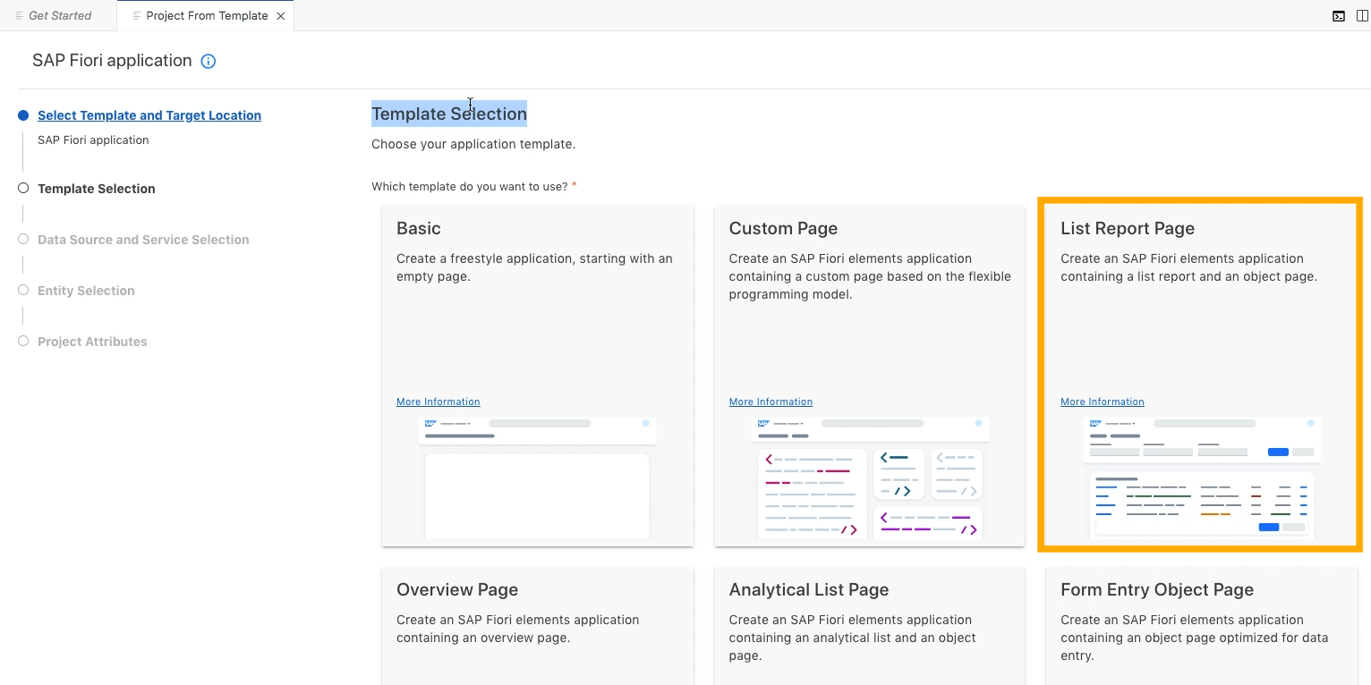
Create a Fiori® Element App from the Template in SAP® BAS using the below steps:
- Select List Report Template Using File > New Project From Template [Screenshot below]
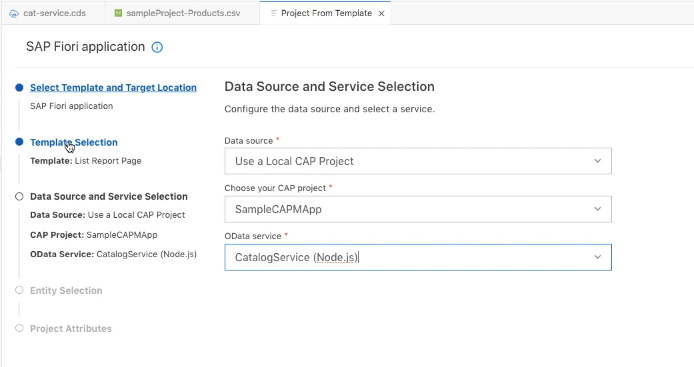
- In the Data Source Screen, select Local CAP Project > Project > Catalog service [Screenshot below]
- In the next screen select the Products Entity
- In the next screen keep everything default and select Finish
- The SAPUI5 App will be created inside the CAPM project app folder
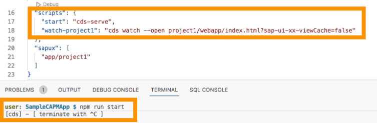
2. Start Script
After that you will find the script to run the project from the root with the command:
npm run [start-or-watch]
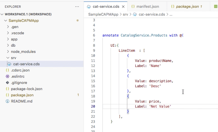
3. Add Line Item
Now add LineItem annotations in the Service:
annotate CatalogService.Products with @(

   UI: {
      LineItem: [
{ Value: productName },
{ Value: category },
{ Value: price }
      ]
    ]
   }
);
This will show 3 columns productName, category and price.
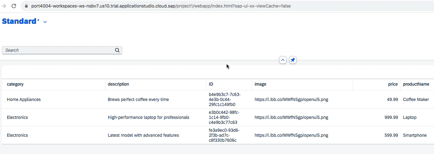
Similarly, now we can add more Annotations using the codes below.
4. HeaderInfo:
Now in the same service file, we can change the default Label of what Kind of Items is shown from Product or Products in the Header columns.
HeaderInfo: {

            TypeName: 'Item',

            TypeNamePlural: 'Items',

        }
5. Header Details
Now to add navigation, we can show the image, title and description for the below code:
    HeaderInfo: {

            TypeName: 'Item',

            TypeNamePlural: 'Items',

      TypeImageUrl: image,

            Title: {

                $Type: 'UI.DataField',

                Value: productName,

                Label: 'Product'
            },

            Description: {

                $Type: 'UI.DataField',

                Value: price

            }

          }
6. FieldGroup
We can also Group together different fields using FieldGroup and show them together:
FieldGroup #Overview: {

          $Type : 'UI.FieldGroupType',

          Label: 'Overview',

          Data: [

            {

            $Type: 'UI.DataField',

            Value: productName

            },

            {

            $Type: 'UI.DataField',

            Value: price

            }

          ]

        }
7. Facets Using FieldGroup
Also, we can add many FieldGroup using Facets to the Screen with different tabs with the below codes:
Facets: [
                     {

                          $Type : 'UI.ReferenceFacet',

                          Label:'Overview',

                         Target: '@UI.FieldGroup#Overview'

                        },

                        {

                          $Type : 'UI.ReferenceFacet',

                          Label:'Tech Details',

                         Target: '@UI.FieldGroup#TechDetail'

                        }

         ]
Tabs will be created and different Groups will have information on the Fields associated with the Group.
8. Nesting of Facets
Now we can also use Collection Facets to Nest multiple Facets Together.
Here you will see that the collection doesn’t create tabs but groups them together.
Note: It is mandatory to define an ID for collection facets but optional for reference facets.
           Facets: [
                        {

                          $Type : 'UI.CollectionFacet',

                          ID    : 'FacetIdentifier1',

                          Label:'Read Overview',

                              Facets  : [

                                {

                                  $Type : 'UI.ReferenceFacet',

                                  Label:'Overview',

                                  Target: '@UI.FieldGroup#Overview'

                                },

                                {

                                $Type : 'UI.ReferenceFacet',

                                Label:'Tech Details',

                                Target: '@UI.FieldGroup#TechDetail'

                              }

                          ]

                        }

              ]
Also, you can make two collection Facets and have details within each other
Facets: [
                     {

                          $Type : 'UI.CollectionFacet',

                          ID    : 'FacetIdentifier1',

                          Label:'Read Overview',

                              Facets  : [

                                {

                                  $Type : 'UI.ReferenceFacet',

                                  Label:'Overview',

                                  Target: '@UI.FieldGroup#Overview'

                                }

                          ]

                        },

                        {

                          $Type : 'UI.CollectionFacet',

                          ID    : 'FacetIdentifier2',

                          Label:'Read Overview',

                              Facets  : [

                                {

                                $Type : 'UI.ReferenceFacet',

                                Label:'Tech Details',

                                Target: '@UI.FieldGroup#TechDetail'

                              }

                          ]

                        }

              ]
The final result will look similar to the screenshot below in the Navigation Details Screen. Based on the Nesting of Navigation the Final Result will differ.
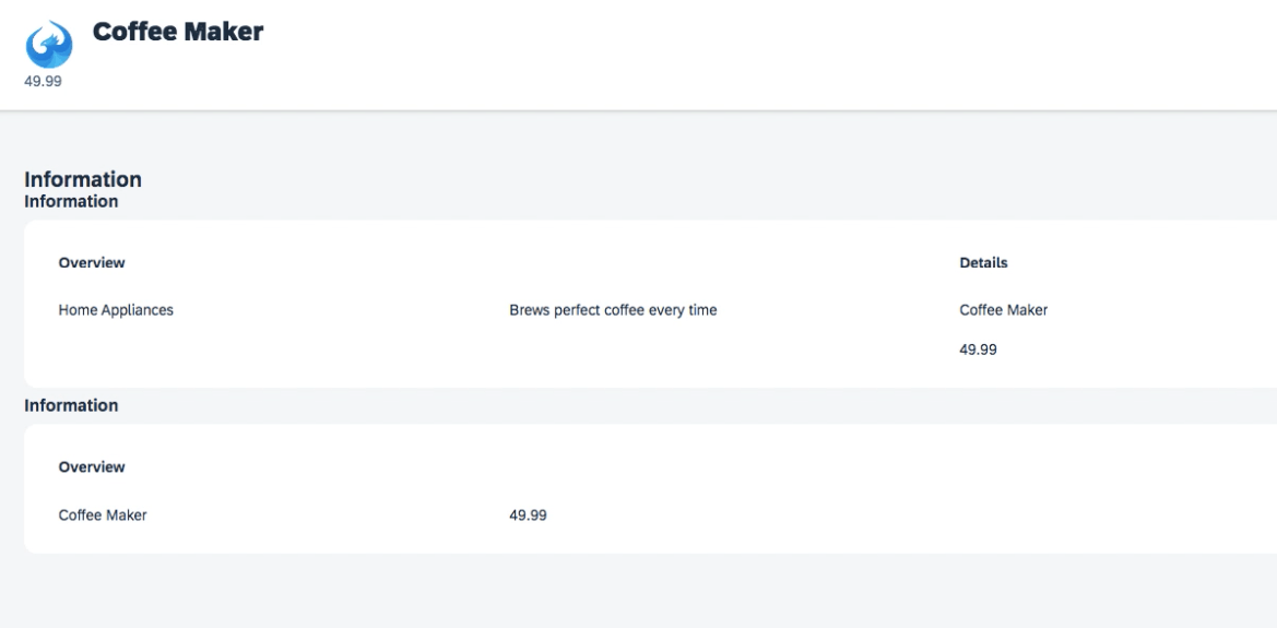
Good practice is:
1. Not do the nesting more than 3 levels.
2. Not referencing more than 1 Reference Facets per collection or you will face rendering issues.